


Forks in the Road - Part 1
Little decisions steer the outcome

Readers enjoy watching the drawing process as a fast-moving video. Heck, even I get a kick out of watching what I drew. Unfortunately, the linear compression of a timelapse video glosses over the numerous decision points along the road to a final drawing.
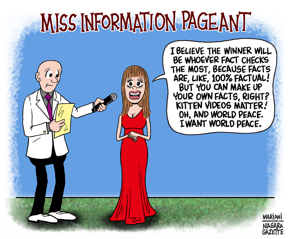
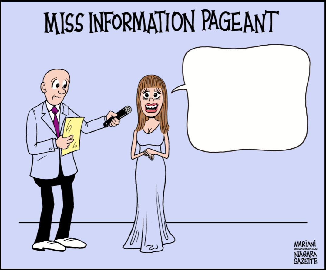
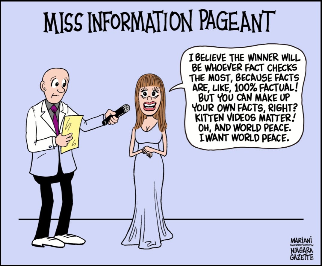
So today, I’d like to slow down to illustrate my choices and why I made them. The art above is the final published cartoon. It’s pretty simple-looking, but the path to this destination was tortuous.
The making of this week’s “Miss Information” video is divided into two sessions. The first part is a 30-second clip, which takes you from a rough sketch to crisp black-and-white art, traditionally called “line art” by those in the printing business.
Of note is my use of online images for reference. For years, illustrators and cartoonists maintained extensive collections of photos and pictures clipped from magazines and other printed material. For instance, one could get an accurate depiction of a real snowblower instead of guessing. We denizens of snow country might have such hardware committed to memory, but our colleagues in the tropics might need some help. Google searching spits out images of just about anything we ask of it. I thought it would be wise to call up a few beauty pageant images to help me with this cartoon.
I’m not breaking the first video down; I want to get you to the following video, where I add color to the line art.
Microsoft’s free Clip Champ software compressed the video into a 21-second production. It starts where the first video leaves off.
I’ve selected 22 screen captures from the coloring video to show you where I made choices, i.e., “forks in the road,” that led to the final art. This post will show only the first 6. Did I hear a sigh of relief? I’ll assess the depth of reader boredom afterward and make appropriate adjustments for the remainder, which might include scrapping the whole idea.
Ok, let’s roll!
01
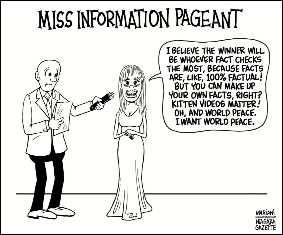
We start with this screen capture, which is the end of the black-and-white drawing video near the top of this post. It served as the coloring process’s base image (line art).
02
I was eager to get going and added one of my standard flesh tones to the emcee’s face.
03
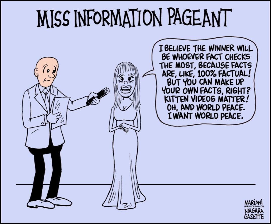
Do you remember the joke that a blank canvas is a polar bear in a snowstorm? That idea did not help me when applying white digital paint to a white background, so I changed the background from white to a light periwinkle-ish purple. This change was temporary. I was considering what colors to use for other shapes, especially white.
Layers Concept
Let’s pull over to the curb for a moment. You may not be familiar with Photoshop* and its layers feature. For simplicity’s sake, consider this cartoon a stack of thin, transparent plexiglass paint-receptive layers, each dedicated to a specific purpose. In this cartoon, there are three fundamental layers at the start.
*For the record, I use a different program with layers called “Clip Studio” for most of my cartoons, but Photoshop has become the generic term for this software group, so I’ll refer to it in the broadest sense.
The bottom purple layer, previously colored white, is the furthest from you. On top of that is a layer labeled “color,” where I paint the various hues. The purple background shows through where I haven’t painted. The next layer above is the line art layer, which consists of opaque black line work and complementary transparent regions. Collectively, when aligned, they add up to a colored cartoon.
04
As I drove forward, I divided the color layer into sublayers that I could turn on and off as needed, but delving deeply into that subject now complicates matters; I want to keep things simple.
The sheet in the emcee’s hand was white, but I changed it to yellow after giving him a white jacket (not yet shown) and white shoes. Now you can see where I painted white; it is not just a background color showing through. The eyes, teeth, the emcee’s shirt, and shoes were also colored white.
Like the color layer, I broke the line art layer into sublayers. For instance, the woman’s dialogue lettering in the source file is a standalone line art (black) layer, as shown earlier under 03. I turned it off and filled the word balloon with white.
05
I continued to fill in the jacket with white and changed the shirt to gray for contrast. I could have made the tie white, but I thought it would look too much like a cinema tough guy outfit.

06
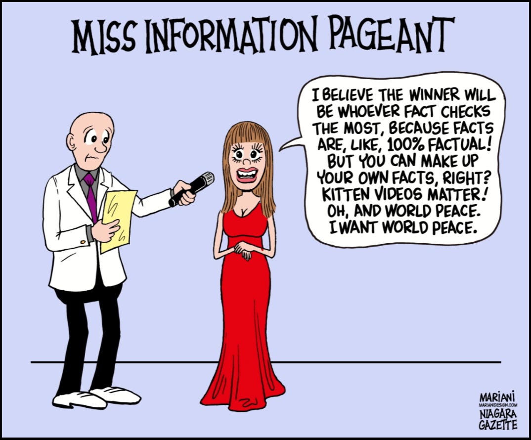
Red was an easy choice for the gown. Miss Information is the focal point of the cartoon.
That’s enough for today. I’ll continue this post soon, explaining more of my choices regarding the characters’ surroundings.
Wake up and enjoy this cringy clip of Gene Wilder’s obsession with Kelly LeBrock in Woman in Red from 1987.
Really cool Frank! Also really funny cartoon and I didn't mind the gene wilder clip either