


This Ain't Rocket Surgery
There will be some pain.

I believe the dialogue-free editorial cartoon is the gold standard. It’s a hard target to hit with originality and regularly. There has to be widespread awareness of the story or condition behind the cartoon, plus immediate recognition of the characters, whether they are world leaders, high-profile celebrities, or icons such as Lady Liberty, Uncle Sam, and Santa Claus.
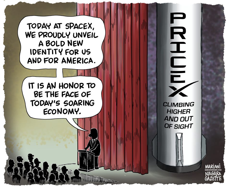
Just below the silent cartoon in my personal hierarchy is a drawing also without the spoken word, but there may be text elements. Some of these characters come in the form of signs to identify a building, well-known brand names (SpaceX, for example), handheld protest signs, roadside markers, or overhead directional panels on a highway, all of which are easily embedded components.
At the bottom of my shortlist are cartoons that slap labels onto icebergs, nearby ships, incoming asteroids, volcanoes, and other harbingers of doom. These are too easy to do and usually boring as hell.
I didn’t listen to K.I.S.S. (Keep It Simple, Stupid)

In striving for simplicity and efficiency, my first idea was like the printed cartoon’s trimmed version above. The current SpaceX logo shown below

benefits from having its name mean something, and it appears on rocket ships. There’s no mistaking a SpaceX rocket for anything else. Imaginatively speaking, it was a short leap to go from an ascending rocket to ascending prices. The task looked easy. “SPACE” and “PRICE” are five-letter words and already share three letters. Better yet, “P” is easily derived from “R”. That left me with the letter “I” to draw. Here’s where my inner typographer kicked in.
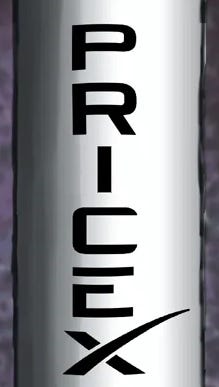
While highly stylized, SpaceX characters are essentially sans serif, so an uppercase “I” is a skinny little orphan surrounded by brawny full-width characters. I solved this eye irritant by adding top and bottom serifs created from the letter “C” to get five letters of roughly equal presence.
Overworking the gag
I ignored the “EXIT CARTOON HERE” sign and became a victim of compositional guilt. I felt compelled to fill out a more squarish format to fit my newspaper’s slot for editorial cartoons. The final cartoon is essentially a two-panel cartoon. On the left is the setup, and on the right is the punchline, literally and symbolically separated by a curtain.
In hindsight, I should have had more confidence in my original idea and, even more importantly, had confidence that the reader could figure out the gag. When you lay out the puzzle pieces, you engage the reader with a subtle challenge. It’s far more satisfying for the reader to arrive at the “aha!” moment than it is to have the work done for them.
Should I have followed the K.I.S.S. rule? Yup. Lesson learned. But I’ll trip up again, I’m sure. Thanks for hanging in there and putting up with numerous tense shifts.
A short movie
Oh, before I forget, here’s the “making of” video, a few hours of diddling around condensed into one frenetic minute.
My mind also went to the two recent Space X explosions, as well as to their failure to let aviation departments know when they were planning launches: catastrophic explosions without warnings or precautions.
Cool to hear your hierarchy and I try to remind myself of that in writing too - readers like to figure stuff out, if you leave the right clues. There's something about the SpaceX typography where I have a hard time reading pricex; my brain turns it into chex? So for me the two panel was needed