


For Peat's Sake
Nothing like a slow burn


For many of us “Merkins” living near the Canadian border, all this talk about the “51st state” and heavy tariffs on Canadian imports is offensive. We take it personally. It’s like having a friend turn bad and throw a punch at your little brother. Whatever squabbles we siblings may have had get tossed aside, and now we’re in full protective mode. I don’t care how many Timbits you’ve eaten. You ain’t heavy … you’re my brother!
Trump’s insulting blather directed at our neighbor to the north, whether it’s a decoy or a bluff, is extra personal to me because my mother was born and raised in Hamilton, Ontario, approximately an hour’s drive from the Buffalo/Niagara Falls metro region.
I still have family and friends there, and I feel like apologizing for the bad behavior of a drunk uncle whenever I’m writing to them.
I’d buy this coin in a heartbeat.
Maps don’t lie
Now you know my affection for the Great White North. But let me be clear: From Western New York state, Canada is our neighbor to the west. As 60s comedian Pat Paulsen would say, “Picky, picky, picky.”
The lazy hazy days of summer
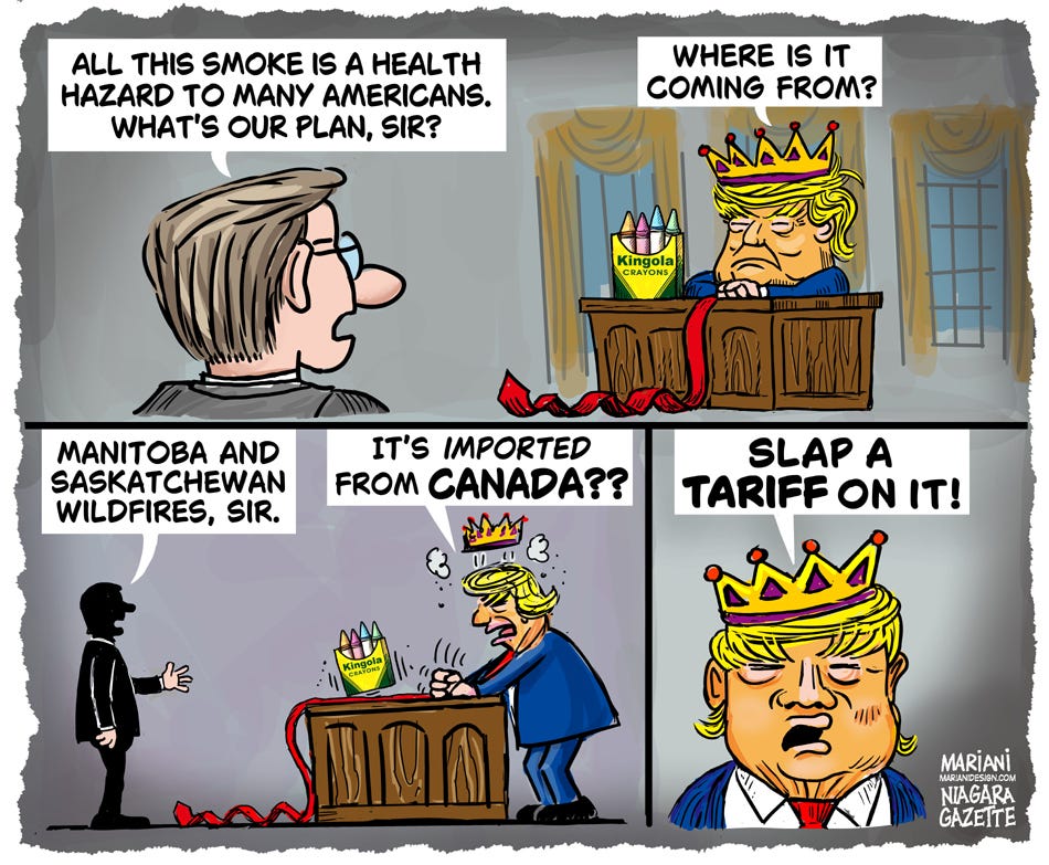
Today’s editorial cartoon isn’t the first time I’ve drawn about Canadian wildfires.
When the peat bogs of northern Ontario were stubbornly combusting in 2023, Buffalonians could not just see the haze, but we could smell it as well. The daytime sun, a fuzzy, edgeless blob, looked like a vision from The Chronicles of Riddick.
From June 8, 2023: Looking at the bright side of the situation.
These fires were not the kind depicted in adventure movies, where skyscraping flames leap from tree to tree with breathtaking speed. It’s altogether different, a slow burn.
Peatlands are carbon-rich wetlands of which Canada holds 25% of the world’s acreage. Unlike typical forest fires that spread quickly with visible flames, peat fires primarily burn through smoldering combustion. What you get are smokescreens that dwarf any weapon of war.

Source: phys.org
From July 1, 2023: Connecting peat to meat.
Wow! I got this far without discussing climate change. Oh, wait, I just mentioned it, but that’s not a discussion. I’ll stay on track here and stick with cartoon making.
From rough to finished piece
Several of my previous posts feature “making of” videos, where you can see time-lapse distillations that condense several hours of work into one-minute reels. I have not enabled that feature lately, but I did take snapshots of this drawing as it progressed.
The sketch above shows that dialogue drives the composition. I had already worked out the verbal exchanges between Trump and an advisor and had to figure out how to pace the delivery. Could I have done it as a single panel? Yes, but I decided to format my cartoon as a short, three-step sequence with a standalone punchline panel.
If my cartoon is free of spoken text elements, i.e., word balloons or captions, then the art speaks alone in the language of imagery. I consider that the gold standard of editorial cartooning, but it is not easily reached, and if you can’t nail it, you may confuse and lose the reader. So, sometimes labels and comic strip conventions are necessary.
With the major elements now in place, I proceeded to the linework and color.
I drew 100% black line work on one layer, and color was applied underneath, as I explained in Layers Concept from a previous post.
The bottom right panel crowded my signature, and you can see there was plenty of wiggle room to fix that.
I removed the “T” lines that divided the panels and shifted the black line art to the left.
Afterwards, I shifted the color elements to the left as well. I have a layer that emulates a torn paper edge, also known as a decaled edge, which I can toggle on and off. I thought it worked well as a perimeter for the sketchy art.
Above is the nearly final stage. Even though it is clear who is saying what, I wanted the words to pop. That plus a bit more cleanup overall, keeping in mind to keep it loose. Panel #2 was a bit too sloppy for me.
It’s easy to get overly concerned with minutiae that don’t matter, but if it irritates my eye and I have time, I take care of business.
For instance, look at the word “TARIFF” in the picture above. The old-time sign painter in me could not let the spacing (kerning) between “T” and “A” go to publication. Furthermore, I wanted the last few words to have more punch. I’d already used the bold option for this font. How could I make it bolder?
The trick is to convert the text to shapes that have no connection to a font. In this case, I isolated “TARIFF” and fattened it up to my liking.
I think you’ll agree that the addition of rectangular word balloons improved the comic visually and in delivery. It was time to ship it out and get to bed.
Thank you for staying with me on this cartooning peek behind the scenes. What I showed you was just a fragment of the dozens, if not hundreds, of zigs and zags an artist makes on the way to final art. Sometimes deadlines force shortcuts, but I was ahead of schedule on this drawing, which gave me time to explain some of the process.
“Wildfires imported from Canada..” ha ha ha!
No need to apologize - Here in Hamilton, the prairie smoke has been mixing with the steel mill emissions (they haven’t been shut down by tariffs… yet) making a pretty putrid reek - so we’re shaking our fists in the air too! Great to read about your process.