


Mr. Penmanship
Some cartoons don't have to be funny, they can get by on good looks.

One of the great benefits of belonging to the National Cartoonists Society is getting exposed to and making friends with fantabulously talented men and women. It’s a surefire way to inflame my imposter syndrome feelings, but it’s worth the price.
Today, for the uninitiated, I introduce Frank Pauer, a veteran cartoonist and graphic designer in Dayton, Ohio.
Frank draws hisself
Frank’s most recent self-caricature has to be admired if for no other reason than he is shown reading [drumroll] a NEWSPAPER! [cymbal crash]

Before I received that drawing, I was ready to go with this one:

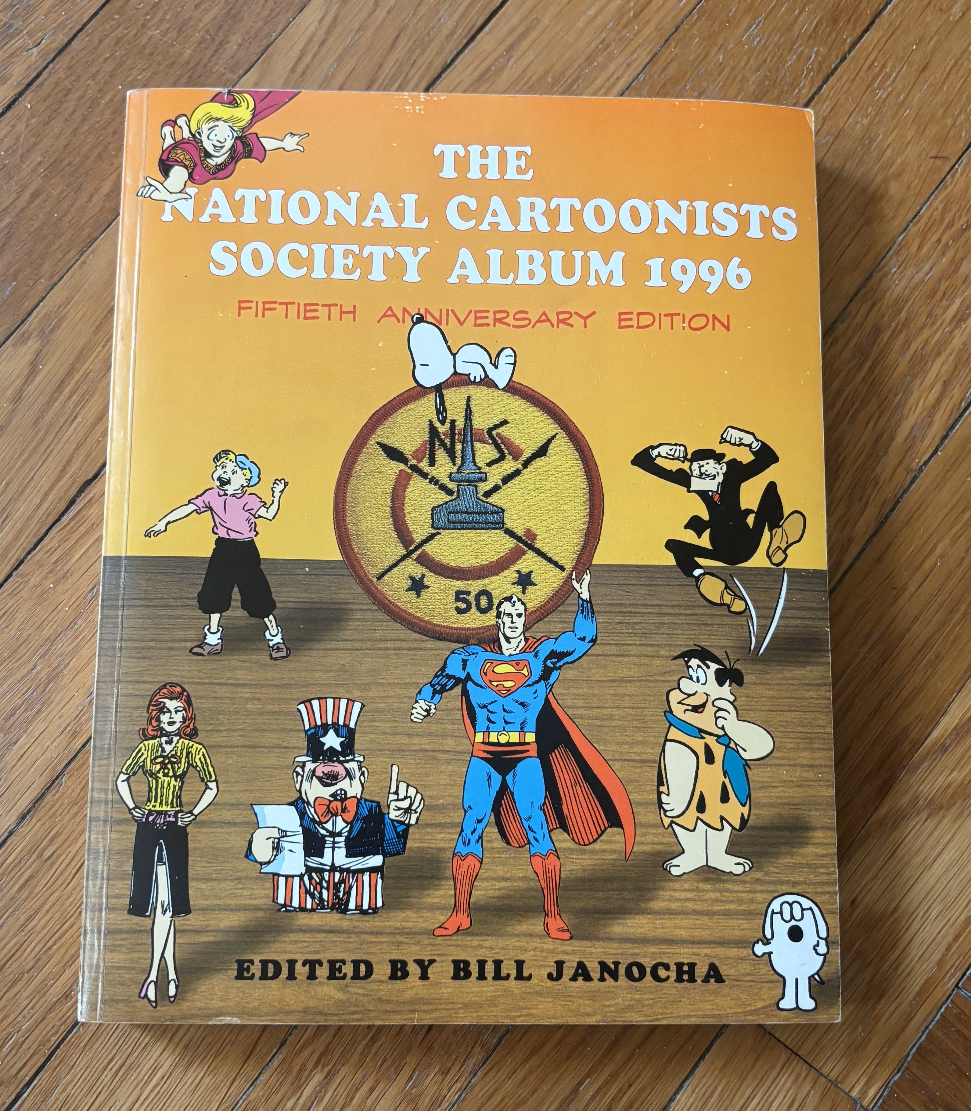
This illustration was used in the National Cartoonist Society’s Fiftieth Anniversary Album for Frank’s entry.
Something about his line fluidity and varied weights entranced me then and still does now. I figured it out: I cannot draw this well!
Frank is a friendly and warm soul, but to me, this scowl served as a warning: “Are you looking for a fight? I’ll give you one!”
That’s a dumb question! I asked anyway
A staple question that fans (and other cartoonists) ask cartoonists, in addition to “Where do you get your ideas?” is, “What kind of drawing tools do you use?”
Frank obliged me:
I'm one of those guys that never graduated from the old school. No tablets or such around here. I use a dip pen holder and ink on Strathmore 2-ply, medium finish (though I've also used plate finish). Interestingly, I am currently inking with an Esterbrook Radio 914 Pen Nib -- the same kind of nib that Charles Schulz used. I have a couple of those -- when they give out I'll use whatever nib around here that still gives me a nice line.
A nice line is an understatement. Dip pen nibs respond to subtle pressure changes by spreading the tines, as shown in this diagram. This feature allows the artist to control line thinness and thickness.
However, attributing the quality of a great drawing to the tools employed is a disservice to the art and the artist. Frank’s ability to space fine lines used to indicate shading is first-class. Take a good look at the lines that fill the shirt’s body and sleeves. Comic envy!
I’ve spent many years as a patent illustrator in the age of digital art. Before computer-based drawing applications came to the fore, invention illustrations were rendered much like Frank crafts a cartoon, so I have an extra special appreciation for dip pen creations.
A gallery of good stuff
I asked Frank for permission to share his drawings with all of you. He sent me a batch that appeared on the Erma Bombeck Writers’ Workshop site.
Note the variety of shading techniques that introduce a sense of gray to black and white linework. You’ll see single-line horizontal and vertical hatching examples, and built-up “chicken scratches” are used in the bottom two drawings.


The movie theater drawing merits an enlargement.
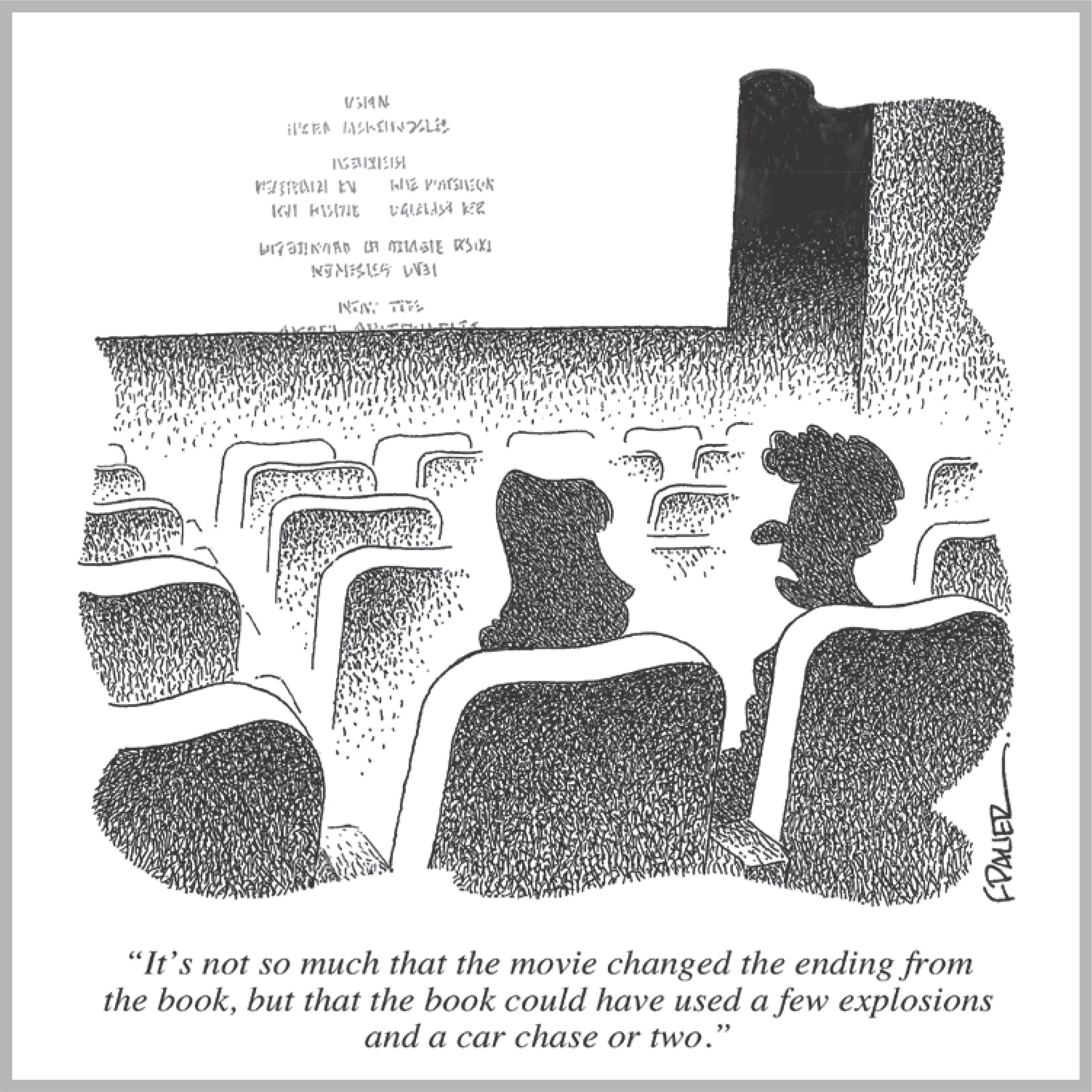
If I had a higher-resolution file, I’d enlarge the silhouettes of the two heads even more. It’s one thing to add hatch shading up to 50% gray, but when you cross that threshold and start approaching solid black, it takes a very skilled hand and trained eye to pull it off. Frank does it masterfully here.
Here are the rest of the Bombeck cartoons:


At the beginning of this post, I wrote that some cartoons don’t have to be funny; they can get by on good looks. I wasn’t calling out Frank’s captions; they’re good and reflect a sophisticated wit. If I had prints of these cartoons without any text, I’d still love them and be proud to hang them on my wall.
Hmmm … I’ve got the files and know how to edit them. Maybe I’ll do that!
Thank you, Frank Pauer, for generously sharing your fine work.
Comic Envy will return soon to highlight another one of my favorite cartoonists.
Frank is a wonderful guy and very talented. Thanks for the piece.
Love his line work.